Second Version - Demure
- Mar 29, 2017
- 1 min read
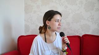
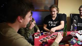
The main improvement of this version is the color correction, I managed to get more experience and understand how the color levels work in Adobe Premiere and I gave the film opening a more cinematic, professional image.
I also made the text smaller and I overlay-ed the title over the last shot so the audience can associate the word "Demure" with the character and the setting. Moreover, when we filmed this shot we actually thought that the title would fit on the wall above the bed.


Comments